Material Design: the design principle for user-friendly software

Design is subject to constant change and causes controversial discussions. It is generally a debatable topic, as there are abundant opinions about it. As we all know, we all have different tastes.
SupplyOn, too, has taken up this challenge and embarked on a new era: introducing Material Design in the development of new business services requires all stakeholders to rethink, demands new strategies and, above all, clear communication.
What is Material Design?
The term was invented by technology behemoth Google and describes a reduced surface design with spaces resembling “materials”. The physical world with its textures, including the way they reflect light and cast shadows, serves as inspiration.
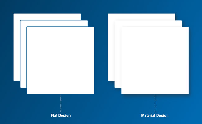
Unlike real paper, our digital material can expand and reform intelligently. Material has physical surfaces and edges. Seams and shadows provide meaning about what you can touch.
Matías Duarte, Vice President of Design, Google
Thus, it aims to transform the traditional work with paper and pencil into the digital world and present it to the user in a sophisticated way.
The idea behind Google’s design language fits SupplyOn’s solutions like a glove. Business processes that were originally set up on paper will be comprehensively digitized and enhanced with virtual collaboration functions.
New design meets enhanced usability
The approach of Material Design is not only an asset for aesthetic reasons. Millions of people use Google’s products every day. Be it search engine, maps, Gmail or Android-equipped smartphones—the design and usability of the interface are widespread and tested.
If you suspect only a new coat of paint at this point, you will be surprised. Of course, all elements get a makeover. However, Material Design combines appearance with function. It is like a symbiosis when a thing not only looks aesthetic but also fulfils its purpose. The following examples of new elements and functions provide a small insight.
The interface
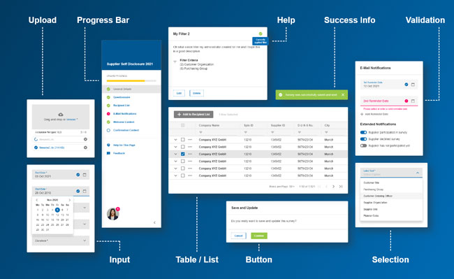
The new design is based on the principle of intuitive usability and a well thought-out interaction concept. The various input options and action elements as well as how you work with tables are fundamentally new. Feedback from the system, such as error messages, is purposefully communicated to the user.
User guidance
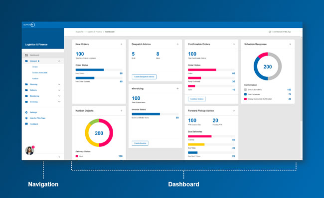
SupplyOn’s dashboards certainly are the most striking innovation. The tile-like display gives users an overview of their tasks and enables them to jump directly to the relevant process interfaces.
The navigation on the left-hand side—a fixed component of all new interfaces, by the way—enables the user to move quickly and purposefully within a SupplyOn service. The user will also find context-related settings, help and much more.
A look ahead
The changeover to a new design is not as trivial as one would expect. The user interface is the visual interface between the user and the underlying functions and databases. Any changes here can have far-reaching consequences.
For this very reason, you need to plan, conceptualize and implement every detail with foresight. You have to familiarize yourself with new situations and reconsider numerous aspects. Thus, you can’ t just change the look like you change your clothes every day.
SupplyOn takes a similar approach here as Google does: given the large number and complexity of our solutions, we will be redesigning the entire portfolio gradually and therefore not as a whole. We first apply the new design to new services and existing central functions with high usage. Existing application will follow suit.
Of course, the transition to Material Design will take a few years. But the step-by-step introduction enables us to continuously publish and launch new interfaces with an improved user experience. This also has a positive and lasting effect on user acceptance of the new design.

