Usability and product design at SupplyOn – it is all about our users

This year we are celebrating a fantastic anniversary: 20 years of SupplyOn. That also means 20 years of experience in supply chain and 20 years of technology. What’s more, there are still a large number of employees who have been with us right from the start. A success story to be proud of.
During all this time, SupplyOn has continuously extended, enhanced and updated its platform. It’s like a house: at some point you simply have to replace the windows or renew the roof. Otherwise things might get a bit uncomfortable.
Considering the wide range of applications that SupplyOn provides for the entire supply chain, this is neither an easy nor a quick undertaking. We put a lot of time and energy into ensuring ongoing operations, but also into supplementary or new services.
An important component of this renovation is the so-called user interface – the surface that the user sees and also operates.
Of course, it is not a “big” challenge nowadays to map technical functions on a web interface. Putting a form field here and there, a table there and last but not least placing somewhere a nicely looking button, or several ones.
Unfortunately, the user – who is a human being and not a robot – is often left by the wayside: Does the user know how to operate the interface? Does he/she understand the labels and symbols? Is the interface logically structured and intuitive to use? Does the person need additional help and instructions?
A miss is as good as a mile
What users need is a solution that allows them to do their job, that meets their expectations and supports them in their daily work. What they often get, however, is something that comes more or less somewhat close to their expectations. In the worst case, it can even turn into an obstacle.

With business applications, all of these aspects are easily forced to take a back seat. I’ m not pointing fingers, but it is a common practice in the software industry. And this is exactly the crux of the matter: Why do I build a software if nobody can or wants to use it?
We are all familiar with this issue, because it inevitably is a question of money. So why not make a sensible investment right away?
Design and usability are key to success
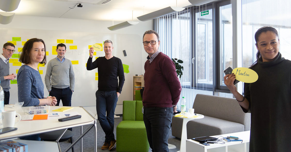
One solution is the User Centered Design approach, which has also been adopted by SupplyOn. Our agile design team, consisting of user experience and user interface experts, is responsible for implementing and supporting this process. Since this article was written by me, it goes without saying that I am also part of this team.
So how exactly does User Centered Design work at SupplyOn? In the first step, we work with the product managers to examine the general requirements for using a new (or revised) application. We also explore the user’s requirements for such a tool. At this stage, we already involve the first real users in the design process. One way of doing this is to conduct short online surveys or personal interviews.
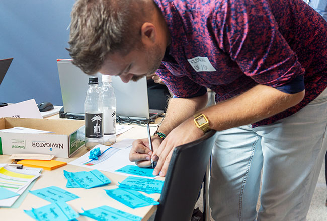
We critically scrutinize everything: we put existing approaches to the test and work on new ideas. At the beginning this can be a bit challenging for our colleagues, because we don’t let any stone to remain unturned.
On this basis, we create a rough concept in the form of so-called wireframes and then test it with real users. We then incorporate the user feedback from these discussions – short: usability tests – in the process.
What is a usability test?With this method, the user is assigned one or more tasks, which he or she accomplishes using given prototypes (wireframes). Meanwhile the user is under observation and is asked to express his/her thoughts verbally. These results are then documented and evaluated. |
|
There are several ways to implement these tests, ranging from classically moderated test to completely virtual processes. In addition, users are interviewed about their general way of working and previous product experiences to better understand their workflow. |
If needed, we then test the wireframes again. We work in an iterative manner here. This means, we repeat all steps until the concept is in line with the user requirements.
From rough concept to the details
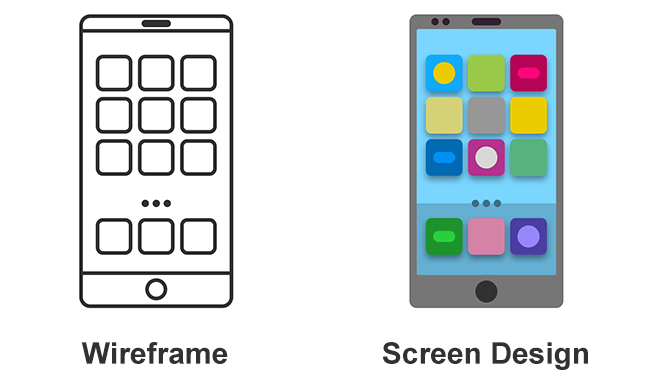
Before we hand over our concept to the development teams for implementation, we first translate the wire frame into a screen design. But what is a screen design? Again, let’s make a comparison with building a house: The wireframes represent the shell of the building, i.e. the bare brickwork with roof and the gaps for windows and doors. You can already see that this is a house. But you don’t know yet which color the walls will get or if wooden or plastic windows will be installed.
Hence, the screen design captures all details of the user interface. A detailed design manual serves as a basis here, which contains all the basics (colors, fonts and wording) as well as the specific design of individual components like form fields, tables and navigation elements. This may sound quite simple at first, but in reality, it is much more complex.
Once the final design has been handed over to the development team, the first step is to “wait”. Until a screen design turns into a usable web interface with database connection etc., you need patience.
And then, finally, the big moment: We can thoroughly examine the first version of the programmed design. The aim of a user-oriented product design is accomplished!
Conclusion
The user-centered design approach is a classic win-win situation: products are created and developed based on the principles of good design and usability. Besides, a professionally tested design solution saves SupplyOn from incurring unnecessary costs even before the actual development has even begun.
The benefits are obvious. Thanks to the enhanced usability, the user gains more confidence and experiences more joy working with the software. For SupplyOn it also means that the focus is not exclusively on providing functions. Design and usability are receiving more and more attention and are becoming a core element of corporate identity.

